
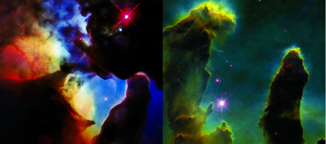
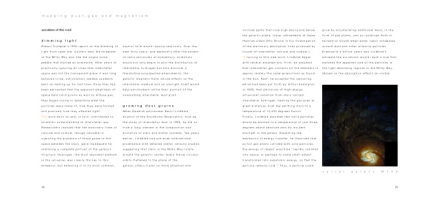
Description This was an assignment for my publication design class. The assignment was to redesign a poorly designed book. I wanted to introduce elements from the night sky into the typography and organization of the book. I had to reduce many of these effects for the sake of legibility, but much of the feeling still remains. The basic page design came from using loosely tracked small white type with a large leading on a black background to give the feeling of stars on a night sky. I kept the same type setting with black type on white pages because I felt the eyes needed a rest after many pages of white type on a dark background. I also used type with different values of gray to mimic space and dimension. These are just a few selected spreads from the book.
|
![]()
| click on any image to view a larger version | |
 |
|
 |
|
 |
|
 |
|
 |
|
 |
|
 |
|